Stay Frosty
One of the more obvious design flaws of the Sony Center on Potsdamer Platz – apart from the first three floors of façade, which is a windowless sheet of corrugated steel (a peculiar mistake to make) – are the metal plates used by the architects as floor panels in the central ‘plaza’.

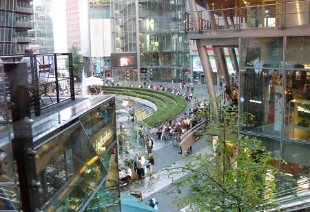
The Sony Center is conceived as an ensemble of buildings surrounding an inner courtyard, and are topped by a roof which mimicks the profile of Mount Fuji. This is an impressive fabric construction, rather like a set of sails which radiate down from the summit like the spokes of a bicycle wheel. Although completely kitch in its approach (it’s dramatised at night with slow-mo disco floodlighting), it does mean that the elements gets in; snow, rain, wind and all. At night in wet weather, if you squint hard, it’s a bit like being in a Syd Mead rendering, which does lend the Center a smattering of grittyness. But let’s get back to those floor panels.

Metal floor panels in a plaza? Excuse the parlance, but what in shit-fuckery were Murphy/Jahn Architects thinking? Here’s a little hint from your friends at SLAB, free of charge: metal is slippery when wet. That’s sound advice, write it down. Even in summer you have to watch how you go here with a pair of tread-worn sneakers on your feet, but in winter, after almost two months of snow and freezing weather, this is trecherous madness.
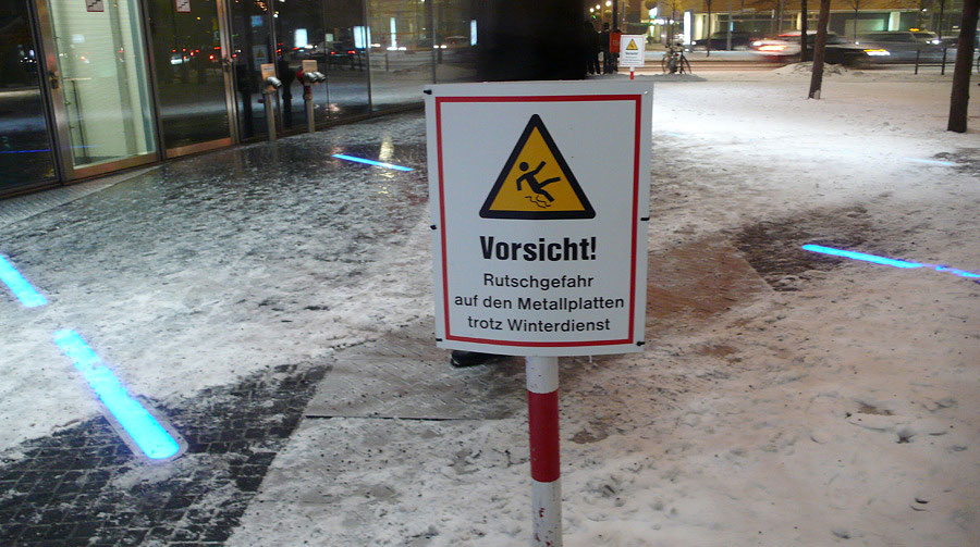
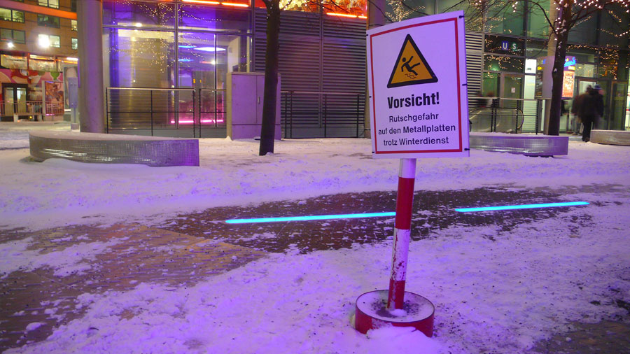
As a work-around, signs have been put up. Unfortunately they fall just short of blaming the architects directly for their misjudgement, stressing instead that extra care should be excersized, despite winter maintenance. Whether or not this constitutes a legal waiver remains to be seen, and as much as I find a litigious society loathsome, it might take a lawsuit or two before improvements are made.

But I doubt that improvements will be made, because, like it or ot, the metal plates belong to a tight æsthetic concept which is obviously of more importance than Grandma’s shattered hip bone. Notice, then, the blue neon strips flush-fitted into the floor. They contribute much to the mysterious doctrine of low-friction surfacing, but also serve to dazzle the visitor from below. This is an important device since it directs attention upward towards the surrounding commercial propositions of beer, bratwurst and block-buster. Other important details include the steel-cage seating, the reflective black surface of the central fountain, the use of glass in exterior fittings and the red paneling on the courtyard façade of one of the buildings. It’s the æsthetic of the pre-pubescent boy’s bedroom translated into architecture: pimply proto-adult taste articulated through the careful hanging of a Ferrari Testarossa poster in a black varnished frame from IKEA.
This article ends as suddenly as the new Coen brothers film, which I saw in the Sony Center.