Just whack it up
“Just whack it up. Just get it out there; like back in the day.” I’m paraphrasing Mr Miller, esteemed Slab raconteur of yore, when I regaled him with an outraged account of fresh architectural horrors discovered last season on an otherwise very pleasant walk through the southern districts with a colleague. Recounting the episode felt like an evocation. An evocation of the kind of things we’d left behind us and long considered passé: like the iPhone 3G, reasonable rents, and the concept of “blogging” regularly. Remember 2006? I refer obliquely to the founding spirit of this journal, and so had Mr Miller: withering scorn, born of a total disdain for contemporary building practices in Berlin, and published fast. Just whack it up.
Well, this is as fast as it gets. I’ve matured a little. I’ve moved on somewhat. But Berlin, it seems, has not. Berlin is content to drag us back into the dregs. Berlin is content with saying “I suppose this will do.” So here I am once more, obliged to poke fun, to ridicule and lampoon. The old masthead of Slab once read “Castigat ridendo mores”, meaning roughly to “correct customs by laughing at them.” That’s a fine statement of intent, and we did laugh: but what happened to the corrections? We did our bit. What about the architects, the financiers, the lawyers, the local politicians, the planners of Berlin?
So colleague and I are out city-hiking. It’s one of my Meltwater Walks, starting out in Britz at Bruno Taut’s Hufeisensiedlung, and the two kettleholes just there. We trek west, passing by Roetepfuhl, another kettlehole, which takes its name from the pond’s historical role as a site of flax-fibre washing, which would dye the water a reddish colour, and thus lend it its name: roet, rot, red. It’s a great day for walking, and for recalling historical factoids such as these. We’re deep in conversation: two gents deep into midlife, heading towards a brewery. We’re happily meandering down streets named after yet more kettleholes (Am Brandpfuhl, Am Bergpfuhl, Am Kienpfuhl), though ones which did not survive urbanisation. We return to the main road, and there it is: the abomination. A visceral horror. A shit-show of architectural savagery. A glorious betrayal.
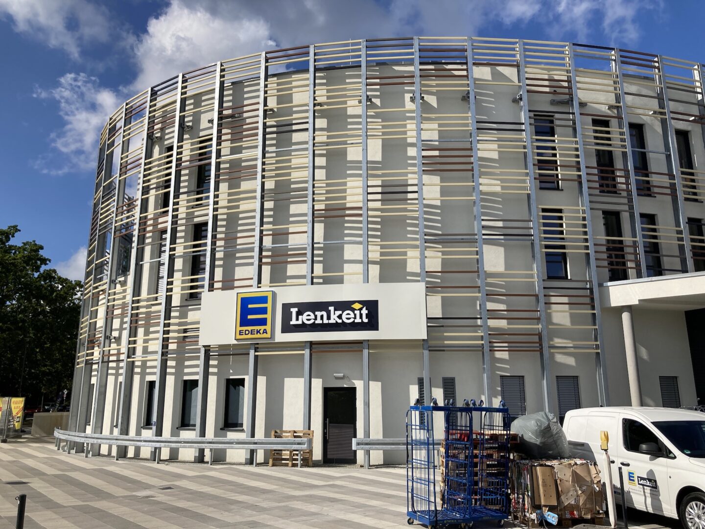
For clarity: these are views of the street-facing-façade. Let me repeat that for it might not be clear: this is the front. The bit you’re supposed to see. The bit which might bid you welcome. The bit that faces the general public. And what do you see from the street? You see the staff-entrance to a supermarket with few discernible windows. You see propped euro-pallets and ramps to subterranean parking. You see the goods entrance and you see air vents. You see crash barriers. Crash barriers for goodness sake.
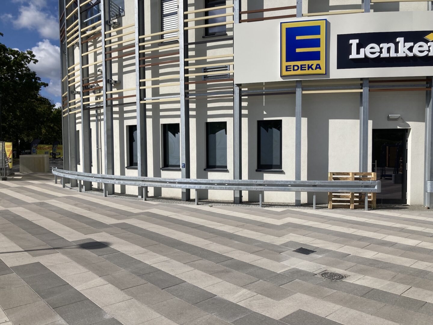
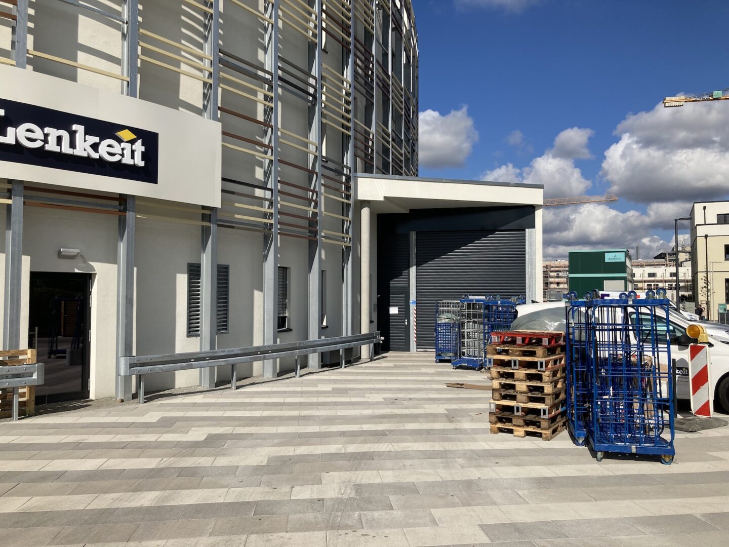
Startling too is the exoskeleton of galvanised aluminium columns and wooden slats, which wrap all the way around the edifice and have no structural function other than to hold aloft a pair of gigantic black portals. Notably, these too seem to have no purpose other than to remind us perhaps of large windows, and maybe to afford those on the upper floors with a view to the south-west unobstructed by a haze of functionless wooden slats. Perhaps the slats are meant to remind us of the wooden Euro-pallets stacked up out front, and the galvanised aluminium columns are there to cleverly harmonise with the crash barriers.
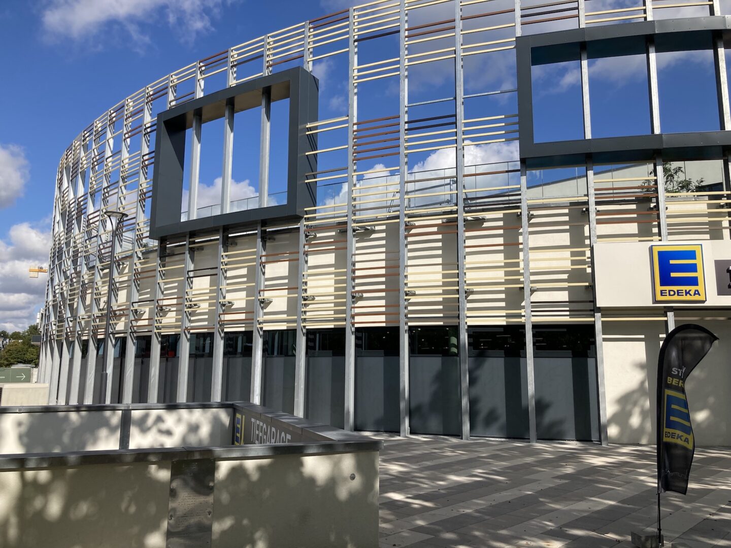
Colleague and I circumambulate the grim barnacle. We’re not yet so well acquainted with one another that he knows about my particular history with this journal. I have to explain. I have to offer context: after-all, I’m in a state of scandalised awe and don’t wish to discombobulate him. But it feels like 2006 all over again. The building looms like a monument to this journal’s heroic effort to affect just about naught (apart from this).
We find a side door – though all doors are arguably side doors on an oval plan – and peer into a stairwell where we regard some awkward but inevitable SLOAP in which pushchairs, childrens’ bicycles and electric scooters will soon retreat, awaiting discreet expiry. Colleague seems airily detached, but is saying sensible, well-adjusted things like “what’s on the upper floors, do you think?”, or, “are those apartments in there?” Meanwhile I’m jackknived over my lower intestines, hands on knees, suppressing a simultaneous nose bleed and cluster migraine, slurring things like “what in actual shit-fuckery?”, and, “this just cannot …”, or, “crash fucking barriers?”
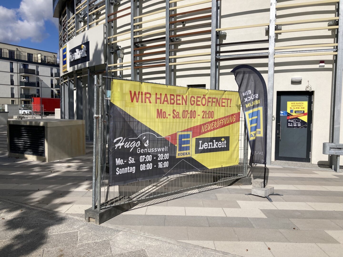
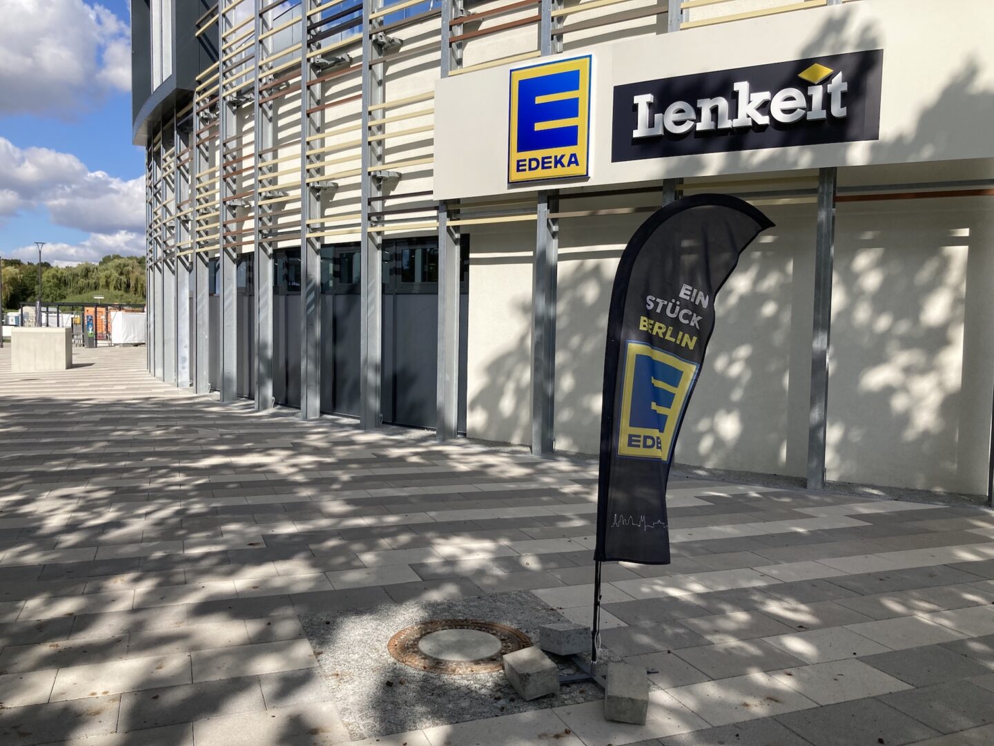
Mercifully, a complete orbit of this beige twiglet-colosseum is swiftly concluded, and we are back on track, but not without first pausing to frown at a deft bit of emergency signage. Two fabric prints hastily tethered to a triangle of construction flotsam jutting into the pavement. “We are open!” declares the Lenkeit family franchise of Edeka supermarket, because the architecture itself is unable to indicate anything of the sort. Though as if that flash of clarity were perhaps too helpful, the lower-left portion is given over to something called Hugo’s Genusswelt, with differing opening times, and little context other than the name itself. Murky corners of the imagination activate salacious speculation. Genusswelt does not translate to English without a hint of sleaze. Does Hugo’s Pleasure World do business within Edeka? At the end of aisle three, beyond the tinned goods and through the fire escape doors: a pulsating S&M club, and Hugo waiting at the bottom of the stairs, resplendent in his latex booty-shorts.
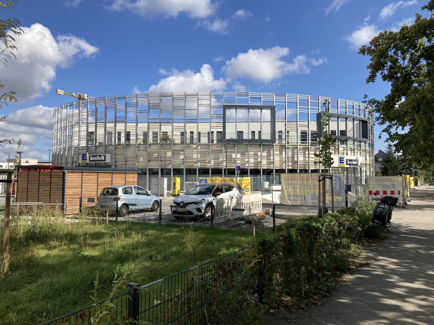
We retreat, and continue west. A glance over the shoulder, and a glimpse at the whole reveals few redeeming characteristics, and no compositional clarity, just a ragbag of weak associations: is it meant to resemble an unravelled wicker basket? Or an abandoned bird’s nest? There is also something fortress-like about this tawdry mess, even as it appears to be in the process of dissolving away into nothing: a castle in the air. Also, is the open-air arena on the first floor meant for sports? Are the slats there to prevent balls escaping? If so, why the purposeful-looking openings?
The local news, the Tempelhof-Schöneberg Zeitung, lacks answers, obfuscating only further. Apparently the building has “exemplary” environmental credentials, with the supermarket saving energy though natural daylight (which must pour through those narrow slits), and its use of natural materials such as wood and natural stone tiles. I guess they just whacked it up, then moved swiftly on.