OG O.M.
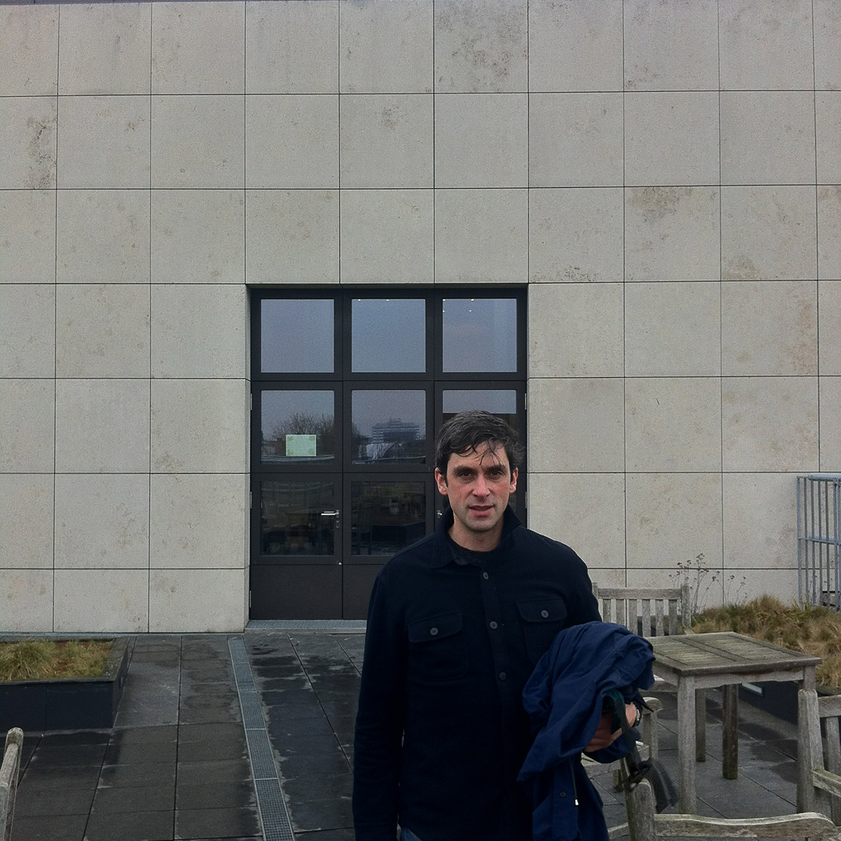
A couple of weeks back, myself and Mr Miller went to the Domestic Relations Court, Tempelhof-Kreuzberg, on a combined architectural field-trip/canteen-lunch. It was built between 1993 and 1996 by the late O. M. Ungers, who died in 2007. Ungers was a man who loved the square, the cube, the square, the cube, the square, the circle, but mostly the square. Elementary forms, which I imagine he got spiritual kicks out of. The court building is no different. The square is everywhere. Most obviously on the façade, whose mathematical rigour manages to unify rhythmic variation and unity, and even a wee joke. Personally, I was expecting a grim, soulless place, void of character or nourishment. But that only really applied to lunch itself, and not the building lunch was prepared in.
The canteen is open to the public, and is on the fifth floor. It has a terrace, but it was too cold to use. This was going to be a joint rambling account written by myself and Mr Miller, and illustrated with sub-standard, mobile-phone snapshots. That only partly holds. Mr Miller’s punishing workload as manager of Nalu Diner, means he has scant time for the generation of words. I hope I can come close to encapsulating the shared spirit of our Unger-encounter. You are kindly asked to note that my own snapshots make liberal use of the ‘square’ function on a decrepit iPhone 4 hand-me-down, as well as the popular ‘smeary lens’ function, which is not an app. It’s smear.
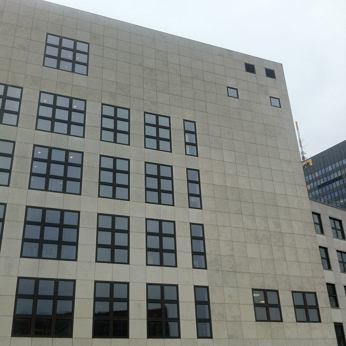
That big grid of windows is actually quite clever. Two columns of 3 x 3 windows. Two columns of 2 x 3 windows. And one column of 1 x 3 windows. It adds up to another big square.
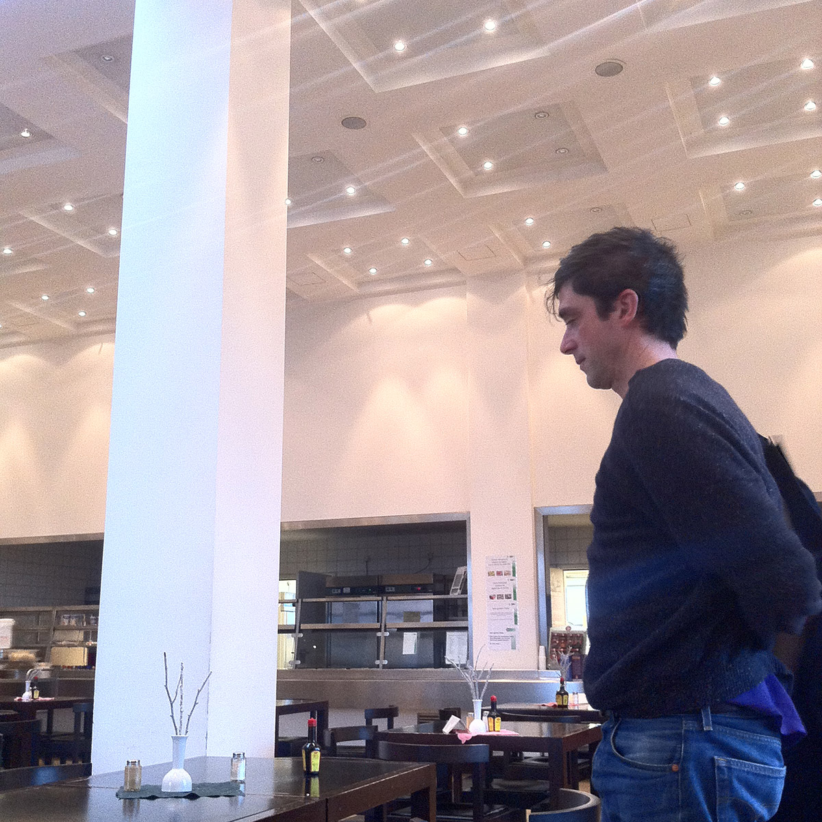
The cassette ceiling is a nice classic touch. Mr Miller in foreground, pondering the wisdom of lunch.
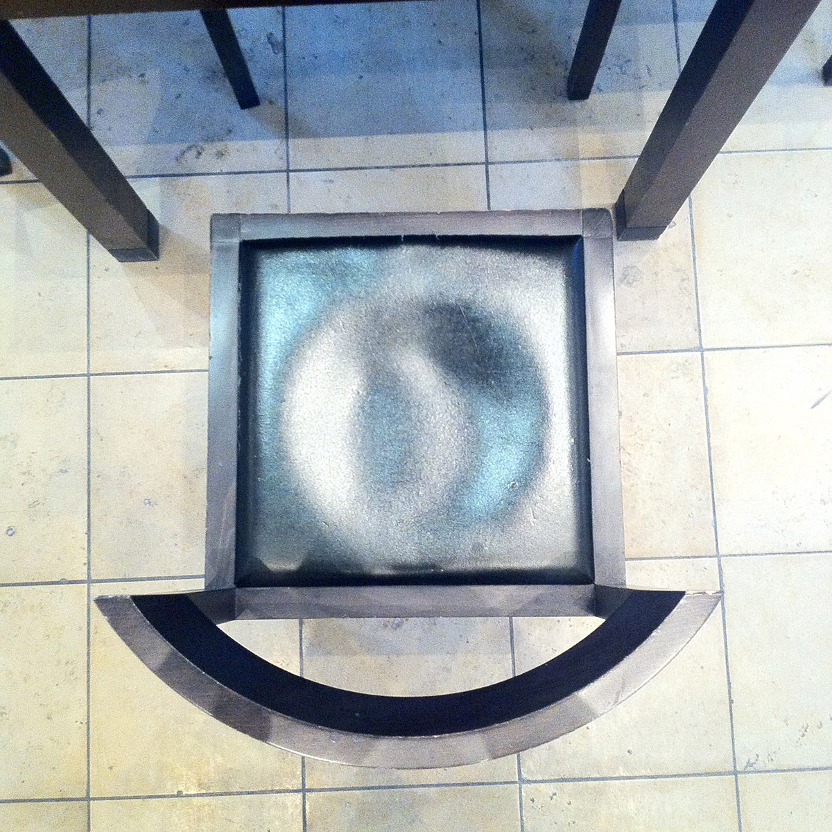
The chairs were very uncomfortable, due to their low backs, which are also segments of a perfect circle, containing a square seat. They’re probably like this to stop the court staff from loitering over their pork steak and thawed deep-freeze veg.
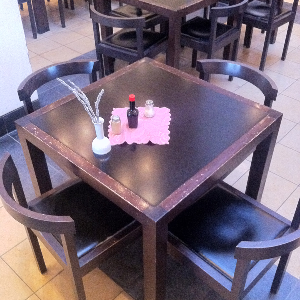
The tables were square, and gosh darn it, so too were the pink doilies.
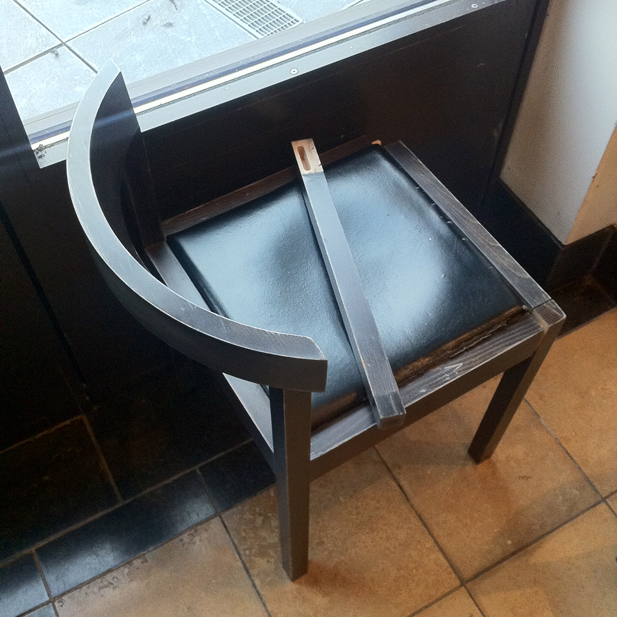
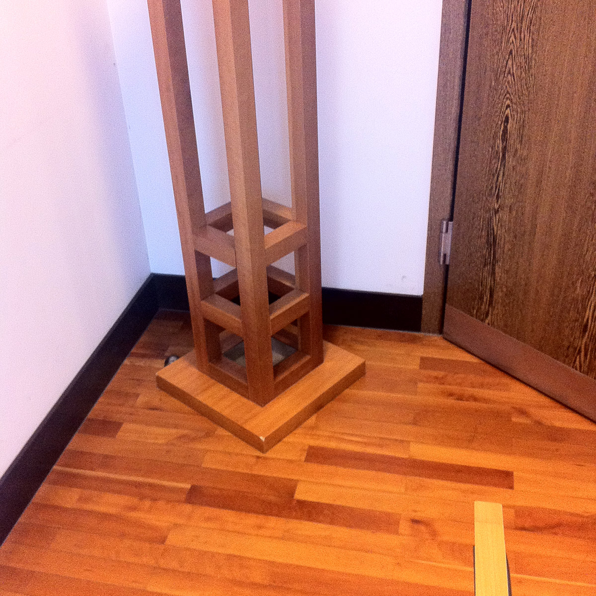
This can happen to the best of them. I wonder how many more they have in storage. Come to think of it, are they custom-designed, or off the shelf?
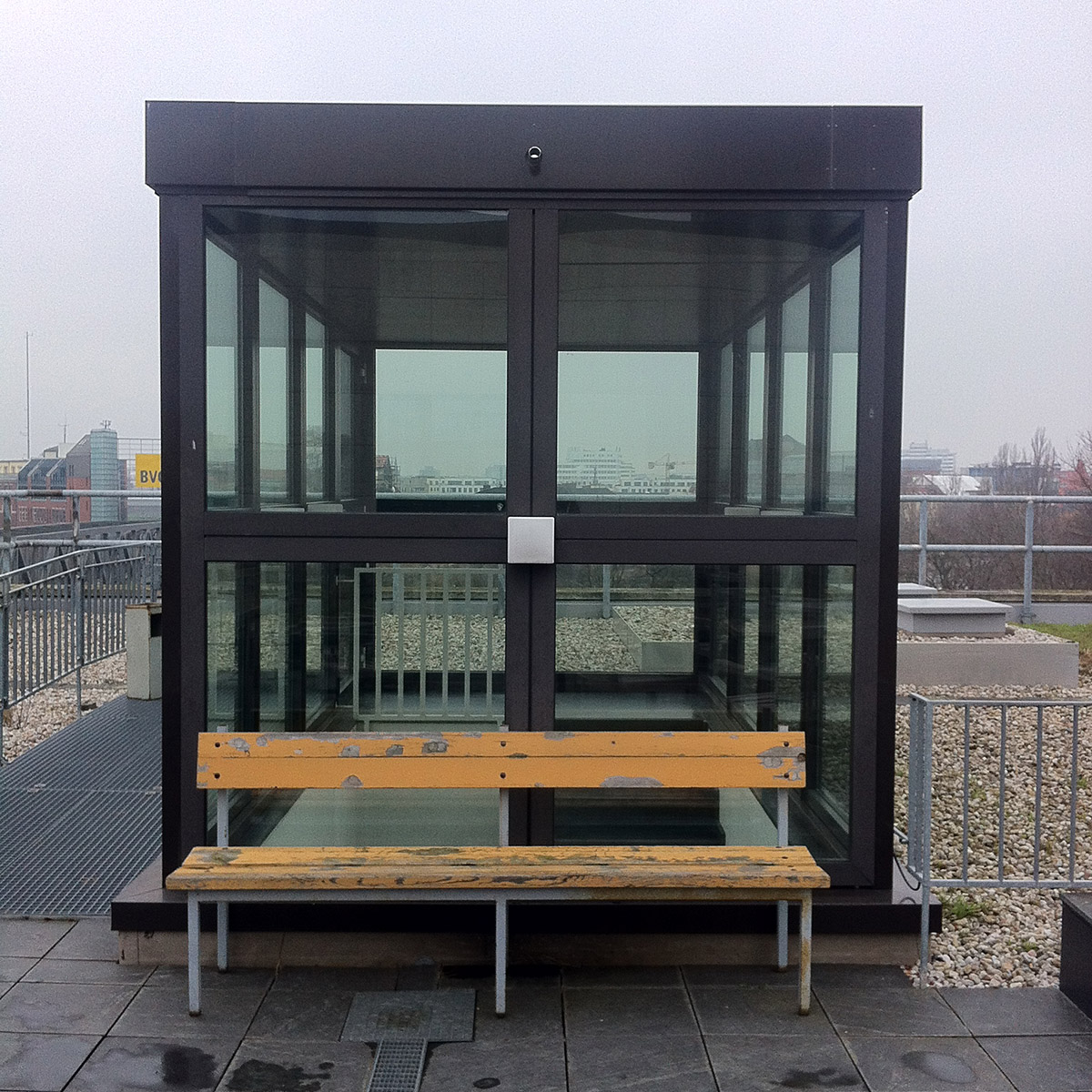
Mr Miller gets ill props for recognising that the white square was a lamp. And he also ‘disovered’ their cubic twin on the inside of the stairwell. Nice touch.
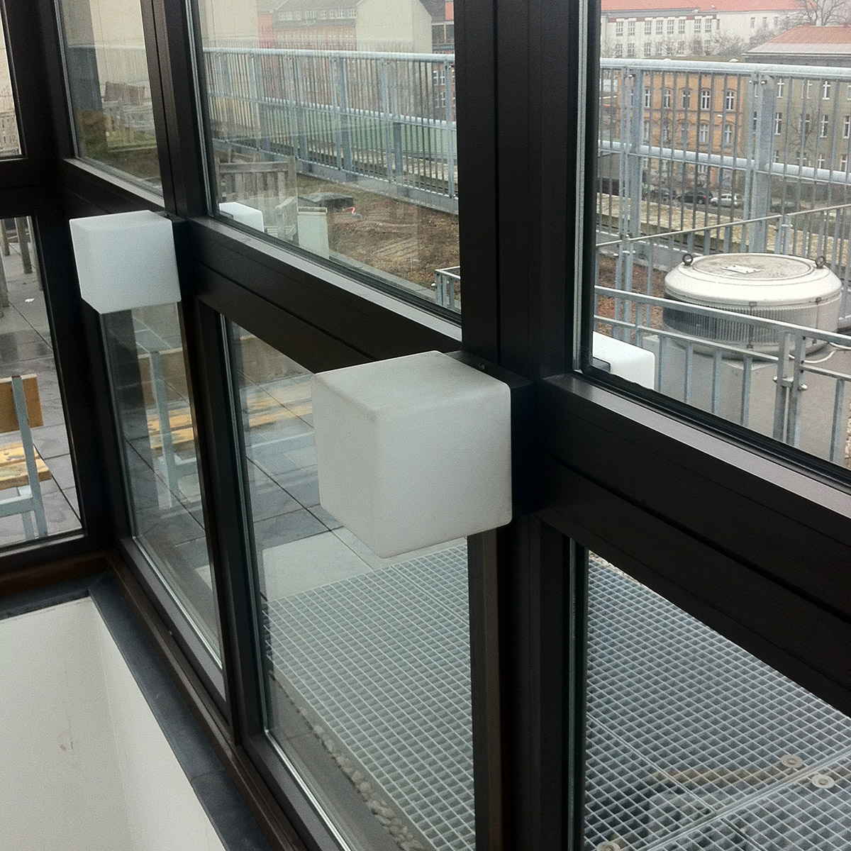
Mr Miller flicked one of these with a deft digit, to make sure it was made of glass, and not plastic. Glass it was. They don’t make them like that any more.
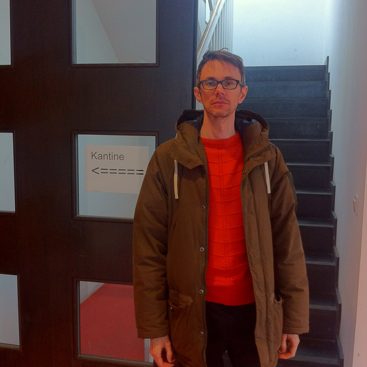
Just look at that hand-made sign. Just look at it.
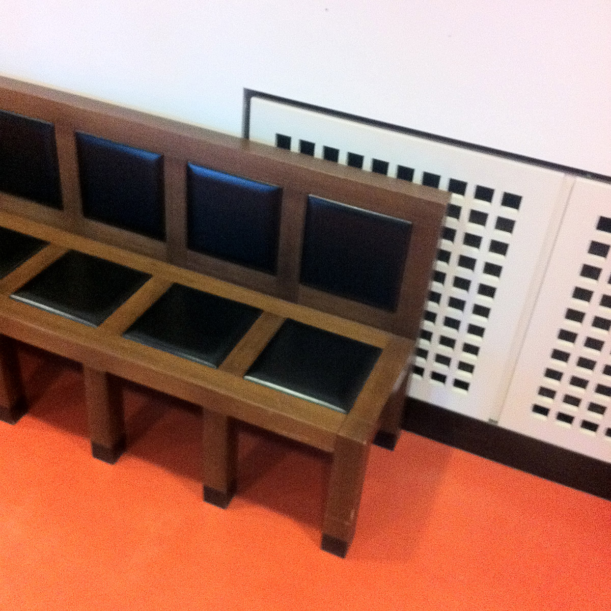
OK. This is where things get a bit Charles Rennie Mackintosh. Cute bench. Looks like it was made for toddlers. But it was roughly adult-sized. Also, our first encounter with the 100-hole air-vent.
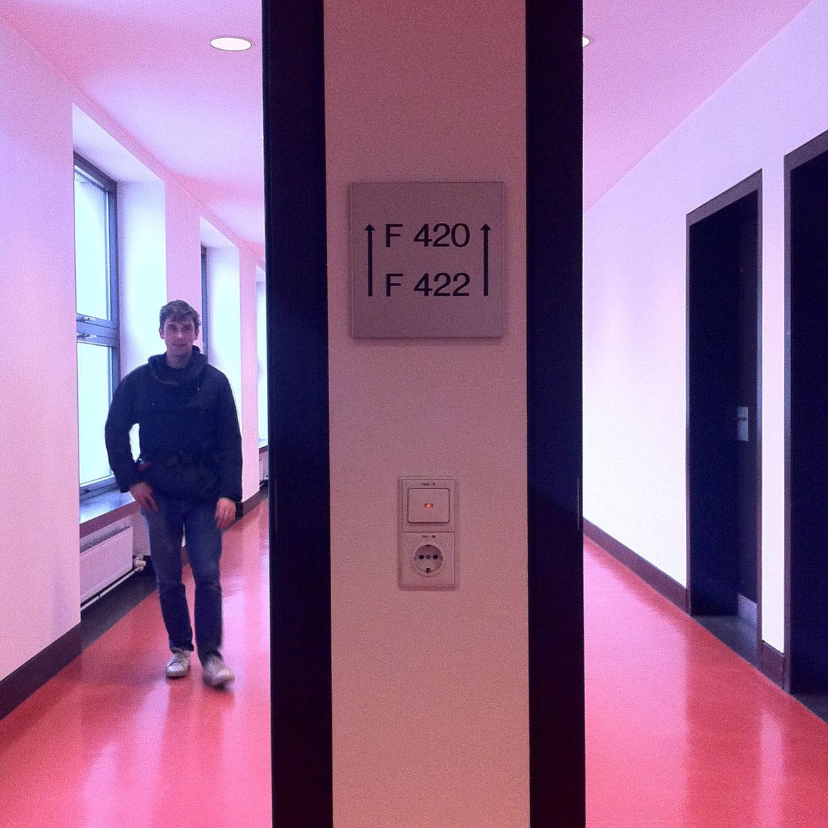
Square signage. Things are getting a bit anal-retentive now. But I still reserve special admiration for Ungers’ persistence. Did I mention that the ceiling vents in the canteen were also …
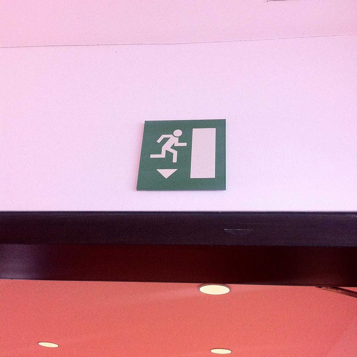
Awesome with a capital OMFG. Presumably an emergency exit for some as yet unknown, square-based catastrophe. Take a look at the arrow: it’s half a square.
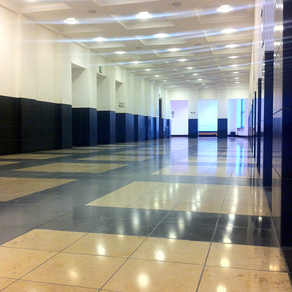
This fourth-floor atrium is where members of public arrive by the lifts. So it’s a kind of reservoir for people transitioning from the general to the specific. It’s where Mr Miller and m’self both began to feel that Ungers had cracked it, and really showed that he knew how to make ‘human scale’ architecture (squares). I felt very at ease in the space. Almost welcomed. That’s a rare thing in municipal buildings. Especially German ones, which are designed to make you feel tiny and alone in a hostile universe in which 99.999999% of everything is lethal to humans.
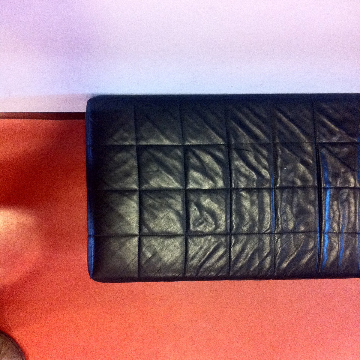
Where the waffle and upholstery arts meet, and make sweet waffly love.
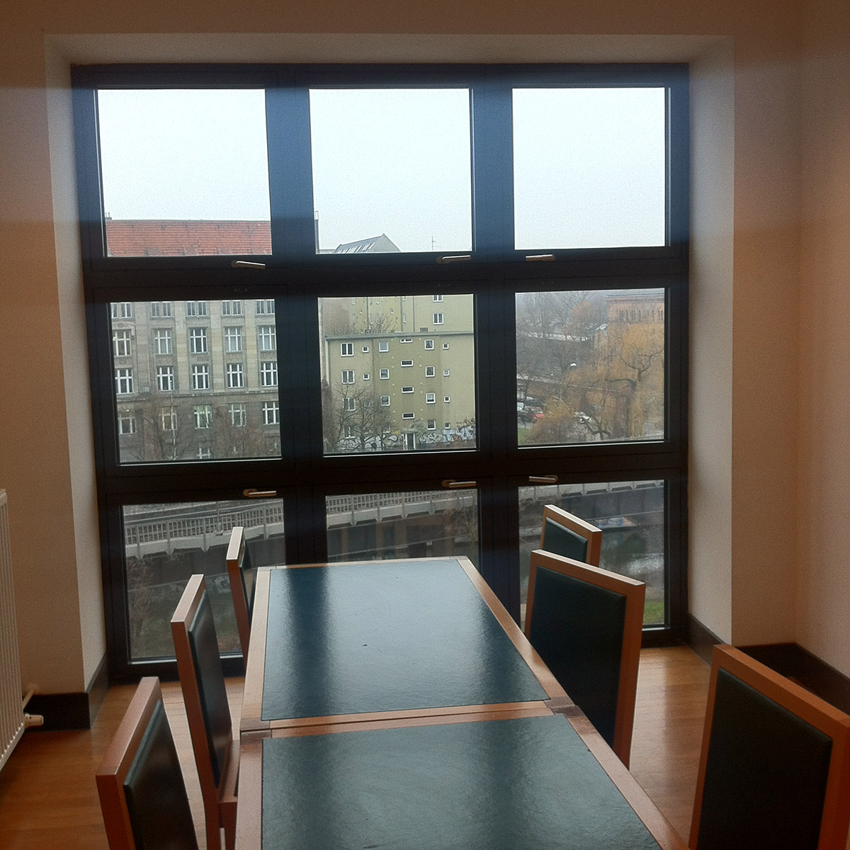
This room was intimate and solemn, but light and optimistic.
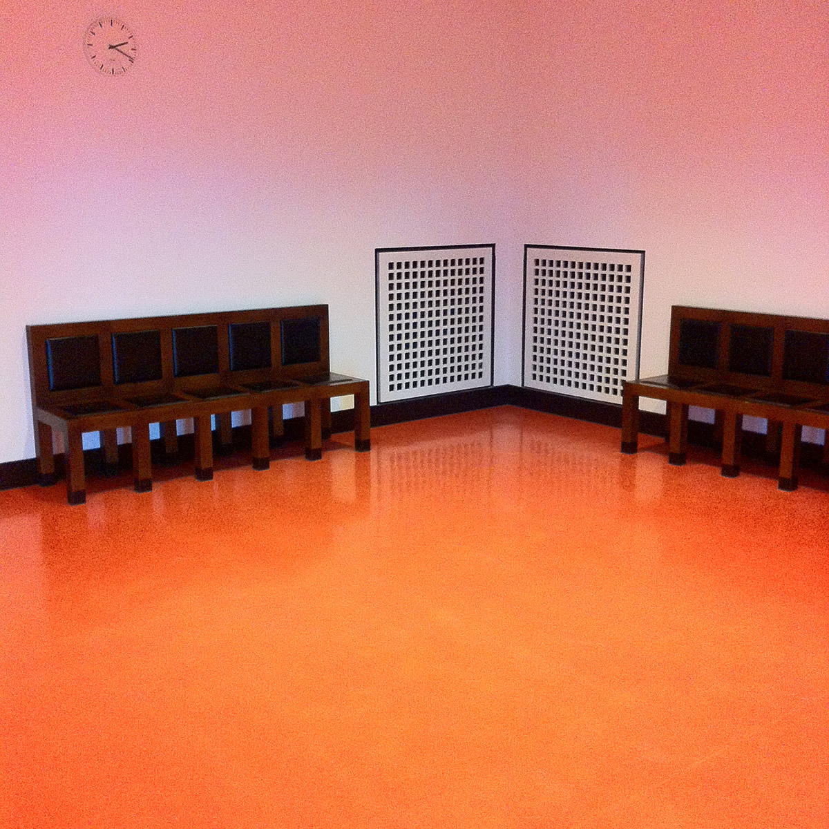
Loved this little anteroom. How long could I stand waiting here? Oh that I knew. Just long enough, one hopes, to count all 200 square holes in the vents. But no longer.
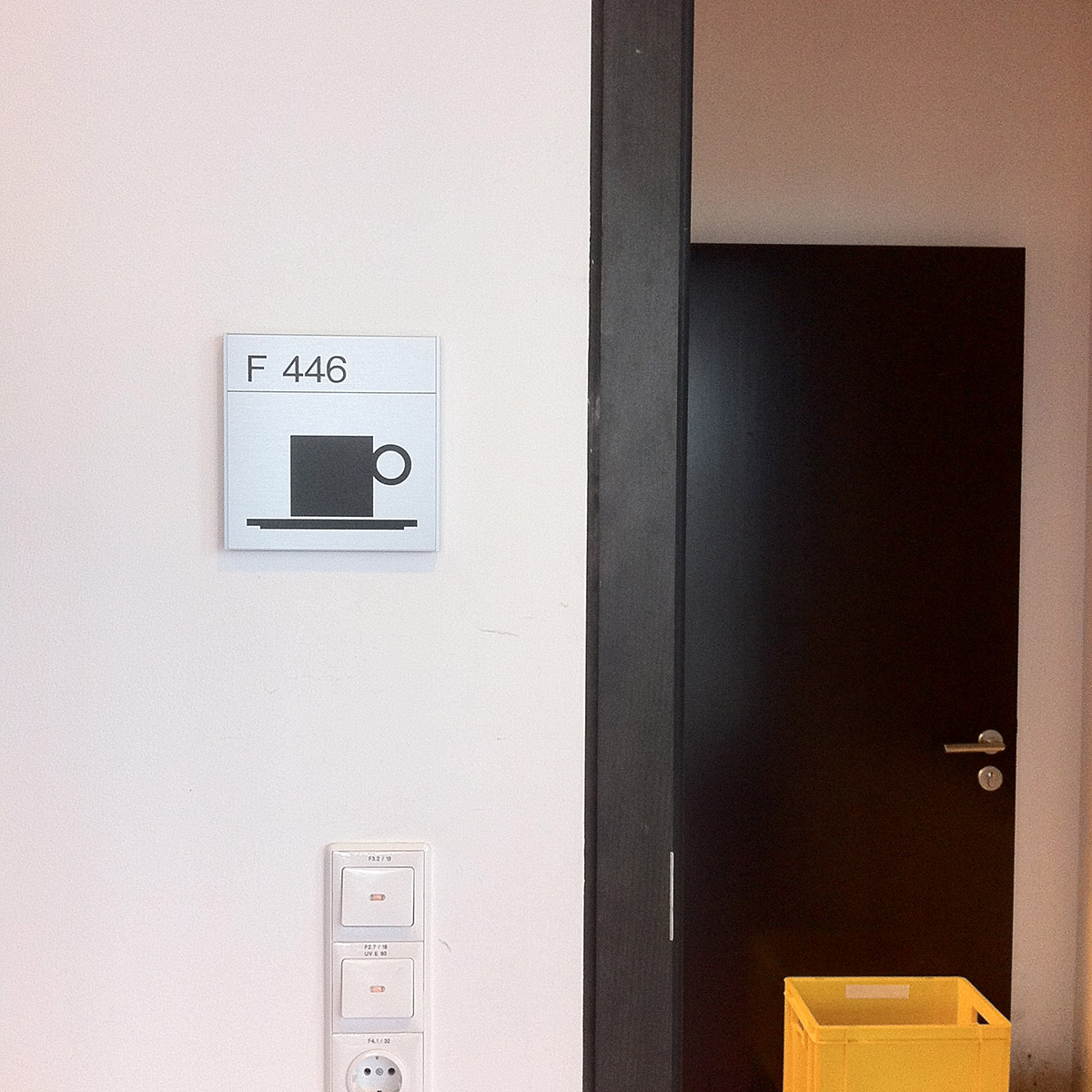
That tea-room icon is the best. It’s a square. With a circle attached to it.
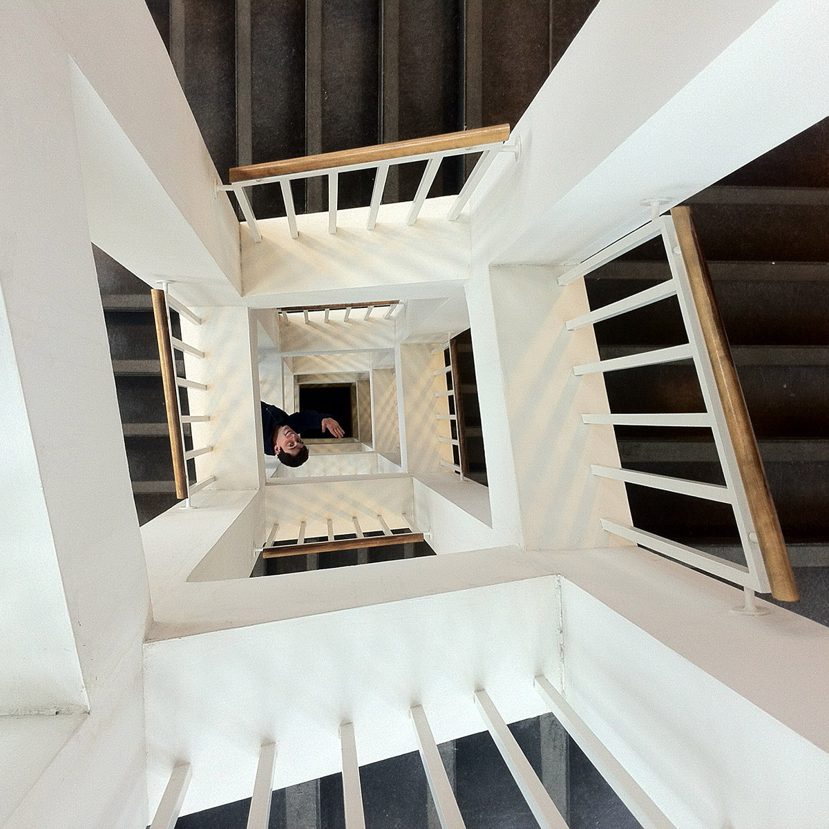
The stairwells were swiftly dubbed “squarewells” by Mr Miller and m’self. They were positioned at the extreme ends of the building on its outer corners. Light could enter from two sides. Also very ‘human scale’: the stairs are just wide enough for two-and-a-half humans.
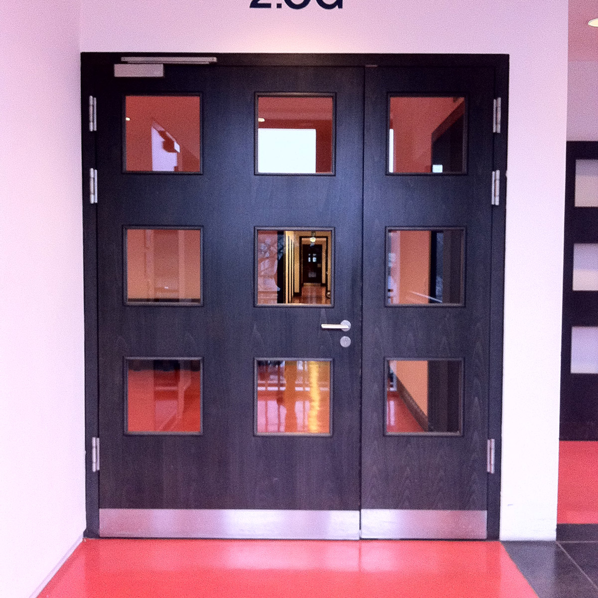
This shot was done without thought, but look how everything aligns within the central window.
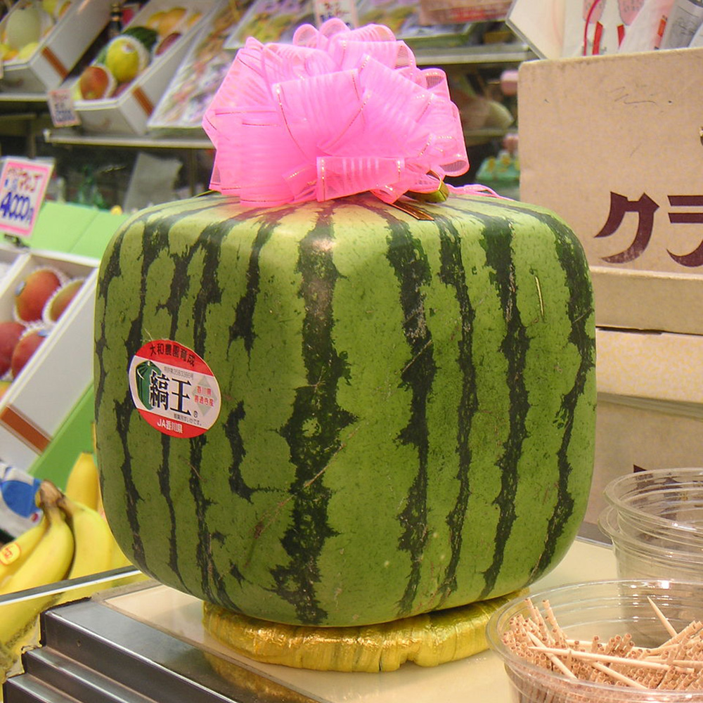
I think I’m going to wrap this piece up by throwing in some pictures of foods I’d liked to have seen in the canteen.
That is all.
