Pet Insurance
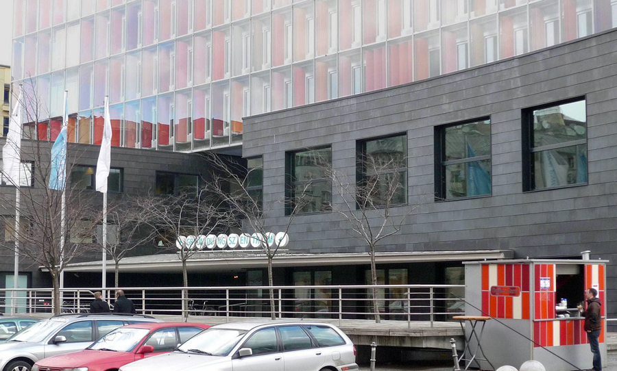
 Selling currywurst can be a transient act, a nowhere, or anywhere event. In Berlin, a wurst might even walk to you. Yet Coffee&Curry, at the base of Sauerbruch Hutton’s GSW building, has loyally anchored itself to the building’s feet, basks in the awe-by-association of the passer-by, flirts in the foreground corner of the postcard.
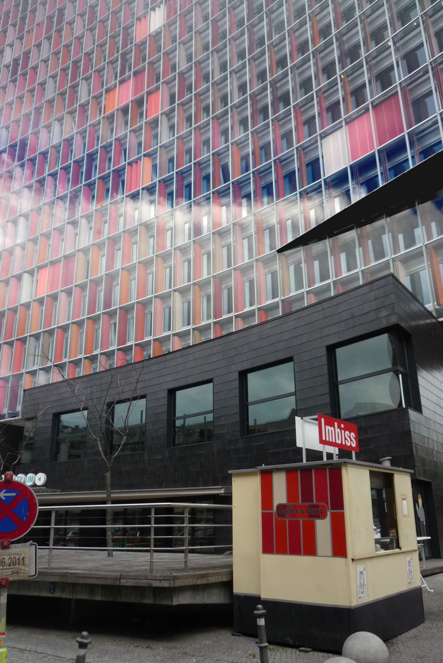
A pet relationship is essentially about belonging. Pets are also faithful derivatives. The signage on the imbiss is a recognizable graphic iteration of the GSW’s famed meat-pixeled rose-pixeled windows hovering above it. It is a tiny copy, a pocket version of a great novel, “paperback” architecture.
Structurally it is a prop, a simple decorated shed. And, as such, a billboard of sorts, albeit one that does not advertise currywurst. No loud drawings depicting smiling sausages attempting to eat their own kind, no giant 3-D wurst toothpicked onto the roof. While the GSW sells you insurance, this imbiss sells you the GSW. In place of mystery pork, it flogs architecture. This shack has staked out an optimal perspective for viewing the building, and invites you to look up, admire, and while you’re there, enjoy a currywurst. Maybe a coffee.
Pets say a lot about their owners. One can evaluate the merits of the building by investigating its tiny copy. And, standing there, I have to ask myself what makes the GSW so special. Special enough that a currywurst seller invokes it to sell sausages.
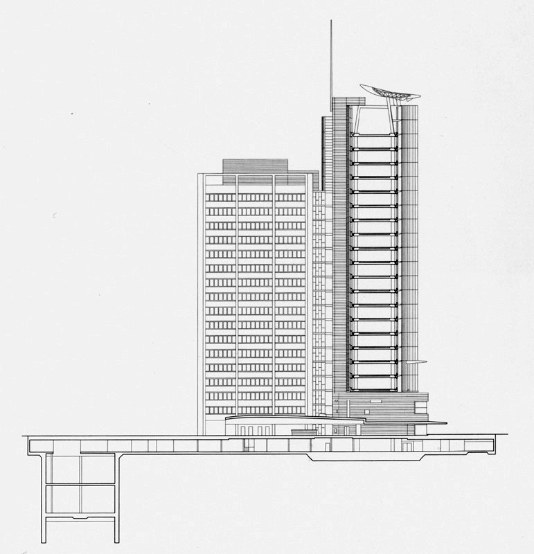
It is in fact a structurally gymnastic building. The original rectilinear tower from the 1950s not only still stands, but acts as a sort of stiffening spine for the wing-shaped addition. The wing is essentially tied back to the tower, and each junction between platform and wing and tower is beautifully, cleanly detailed. Shadows obediently follow built lines, the framing is delicate but not fragile.
As with many SH buildings, a colourful facade smiles upon the city, and it is perhaps this gesture that Berliners, as well as the little imbiss, rarely see are drawn to. Within the complexities of built endeavors: contracts, codes, budgets, intricate air management systems, it is the procurement of a soft device: the fabric window shade that garners the GSW’s celebrity in Berlin. Amongst an infinite set of built parts, the window shades, in ca. 8-10 colors, become the building’s most obvious architectural gesture.
A passive heat gain strategy is responsible for the positioning of the massive glazed elevation, and this, as the building’s driving design principle, made it a winner with the clients, for sure.
But for the rest of us, it has more to do with its west-facing facade and the sun. Standing on Rudi-Dutschke-Strasse at Friedrichstrasse at various times of the day, you will encounter constant references to the cosmos. At noon, the facade is lit up in sunset oranges, reds and pinks, shades drawn against the sun, and later, in the evening light, shades open, the glazing reflects the real thing. Perhaps it is the quiet, intuitive performances of buildings that really communicate with us – on a frequency below glass domes, gurkens and pregnant oysters.
The first time I came across the imbiss was in March 2010, at which point it was blooming with GSW pride: red-orange pixel window ornament on 3 sides. It has since been “modernised”, namely in its reduction of colourful pixel-rectangles to one applied sticker on a newly painted cream metal box. Yet, in the end the little imbiss remains loyal to its owner, keeping the last panel, the last semblance of its pet relationship, on its west-facing facade.

