Stack ’em High, Sell ’em Low
At fifteen or sixteen I’d grown out of the family hi-fi system down in the living room, and wanted a set-up in my own bedroom. I started researching possible components in hi-fi magazines and came across an ad for a business in London called Richer Sounds. They were operating as a kind of hi-fi discounter, and it was in this context that I heard the phrase “stack ’em high, sell ’em low” for the first time.
The phrase was a kind of mini revelation, and one of my first lessons in basic economics: the correlation between storage and market price.
So here’s what this tale has to do with architecture:

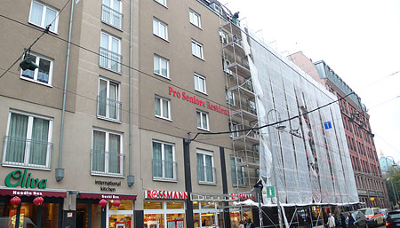
The Pro Seniore Residenzen is a care home for the elderly directly on Hackesche Markt, a busy junction, tourist hot-spot, and historically speaking, a market place. Building-work carried out in the neighborhood since the early 1990s has concentrated mainly on rennovation, and the handfull of new projects which went up are all unremarkable. But the Residenzen building has always been conspicuous for it’s complete rejection of façade design. It is an essay in dreariness: a filing cabinet for human beings, to misquote architecture critic Niklas Maak*.

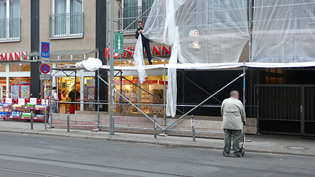
Imaginable, too, that the building was designed automatically by some wretched piece of software which extrapolates a ‘logical answer’ from a data-set of building directives and profit forecasts. Judging by the current need for façade rennovation some ten years after completion, it is clear that the building also represents a rejection of craftsmanship in favour of the lowest bidder.
It’s not the first time I’ve seen major rennovation work being carried out on the façades of newly built structures. The rennovation of freshly rennovated buildings is also not an uncommon sight in Berlin’s new Mitte.
* A reference to the following quip in the New York Times from 2006:
Mr. Stimmann “couldn’t imagine that a street could look like this,” said the architecture critic Niklas Maak, grabbing a pen and pad in a Berlin cafe to sketch a streetscape with buildings of varying heights and widths. He followed with another sketch, in which all the buildings were the same size: “Like this the street looks like a file cabinet,” he said. “That’s what Berlin looks like right now.” [link]