Ikea Logo Bigger Than Your Apartment
A Saturday morning spent in Ikea is a collective experience akin to a Sunday morning spent in church. Globally speaking though, it’s probably more common, and whereas church usualy unites people of similar faiths, a Saturday trip to Ikea unites people of all faiths: from Turkey to Japan, from Island to Singapur and from Canada to Kuwait. The sheer uniformity of the experience, from the blue and yellow corrugated façade, to the meatballs in the café, is staggaring. There is nothing quite as dismal as the thought that everywhere in the world, Billys are being produced, transported, sold, unpacked, filled with books and thrown into landfills right now by the million.
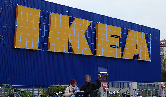
Let’s come back to the façade: SLAB is here to talk about architecture, after all. Yesterday I was struck by the size of the logo on our local branch. It’s probably no bigger or smaller than the logo on the front of the Funabashi branch near Tokyo in Japan. It’s probably standardised anyway. But just how big is it? How does the size of the Ikea logo compare with the size of an average apartment in Tokyo? What is there to learn from the irony that a company dedicated to solving the furnishing problems of small apartments, operates out of peripheral mega-barns the size of football fields?

I took the door in the background to be 2m high, and used this measurement to lay down a perspective grid on the logo. By my reckoning, the total area of all four letters is around 134 sq/m, which is substantialy larger than my apartment in Berlin.
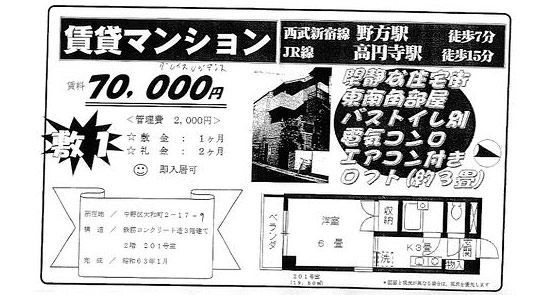
Sakura-house.com, an apartment and guesthouse portal for Tokyo, claims that the average apartment in Japan’s capital is just 62 sq/m in size. Probably an optimistic guess judging by this scanned advert for a 20 sq/m apartment in Koenki which I found on Flickr.

Flickr user ‘noexit’ refers to the traditional Japanese method of measuring room size with tatami mats in the description of his new $700-a-month shoebox:
«Quiet neighborhood, Southeast facing room, Air conditioner, and a 3 mat loft…»
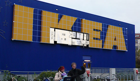
he says, refering to the bedroom above the combined hallway and kitchen. Going one step further, here’s a visual comparrison of the Ikea logo with ‘noexits’s apartment.

What I’d like to see now, of course, is a fully furnished Ikea logo complete with sofa, Billy shelving, throw-rugs and a nice little desk in the corner. You could probably live a healthy life, if a little spartan, in the letter E. Or you could go and take a look at Ikea’s daughter company BoKlok, who actually build homes: once again, reality proves itself to be more absurd than fantasy.
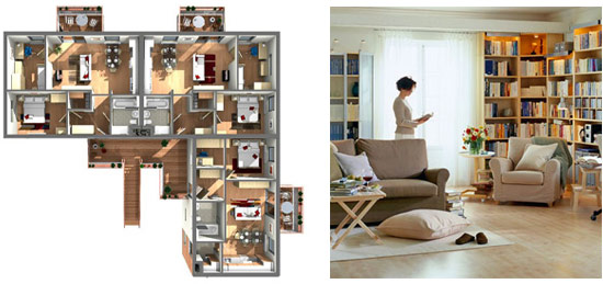
The BoKlock website has a great cut-away top view of its apartment buildings which are, according to the blurb, «small scale, yet effectively designed. Each and every function in the modern home has its place». As if this were not enough, their are «a number of furnishing suggestions for each apartment», and in case you still haven’t understood what they mean, you will be given a £250 Ikea gift certificate and two hours consultation with an Ikea interior designer.

So this is the solution for anyone who has felt the pang of disappointment which usually accompanies any visit to Ikea. The huge discrepancy between the beautifully shot photos in the catalogue, and the bandy off-white constructions in the Ikea showroom can now be avoided simply by buying an entire Ikea home, and, effectively, moving into the soft-focus fantasy world shown above right, where everything has its place, all colours are perfectly coordinated, and nonchalant early afternoon sunlight pours in through generous floor-to-ceiling windows whatever the season.